

A useful AI image needs to do more than look good once. You may need to revise the subject, reuse an asset on another background, or update the text without rebuilding the design.
Seedream 5.5 focuses on those production needs. This guide explains its capabilities, how to apply them, and what to check before treating an output as finished.
TL;DR
For realistic AI images: describe the light, materials, and physical relationships that make the scene believable.
For reusable design assets: native RGBA supports transparent and semi-transparent output. Check the downloaded file and its edges before compositing.
For ongoing revisions: change a clearly defined target and name what should stay fixed. Keep an approved version you can return to.
For text-heavy designs: supply exact copy and a clear hierarchy, then proofread at the final viewing size.
What Is Seedream 5.5?
An image model for creating and refining visual ideas.
Seedream 5.5 is ByteDance Seed’s multimodal image generation and editing model, introduced on November 9, 2026.
It supports creating images from text and working with existing images. Its main upgrades concern realistic rendering, native transparency, text rendering, and consistency through repeated edits.
Think of text-to-image as a starting point for a new scene and image-to-image editing as a way to develop something you already have. Choose the second approach when a subject, layout, or approved design needs to remain recognizable.
Seedream is the image-model family. Seedance serves video creation; the similar names do not make their output formats interchangeable.
Seedream 5.5: 100-Round Editing for Consistent Images
Keep improving the image you already approved.
What Does “100-Round Editing” Mean?
ByteDance’s demonstration describes 100 successive edits, with each output becoming the next input. The changing image includes clothing, accessories, and tabletop objects.
The important production question is whether an edit preserves details outside its target. A strong result should allow a small revision without forcing you to rebuild the rest of the composition.
The 100-round sequence is an official demonstration. It does not guarantee that every image will survive 100 arbitrary edits without drift, and it is not a video-motion benchmark.
Our 30-Round Editing Test
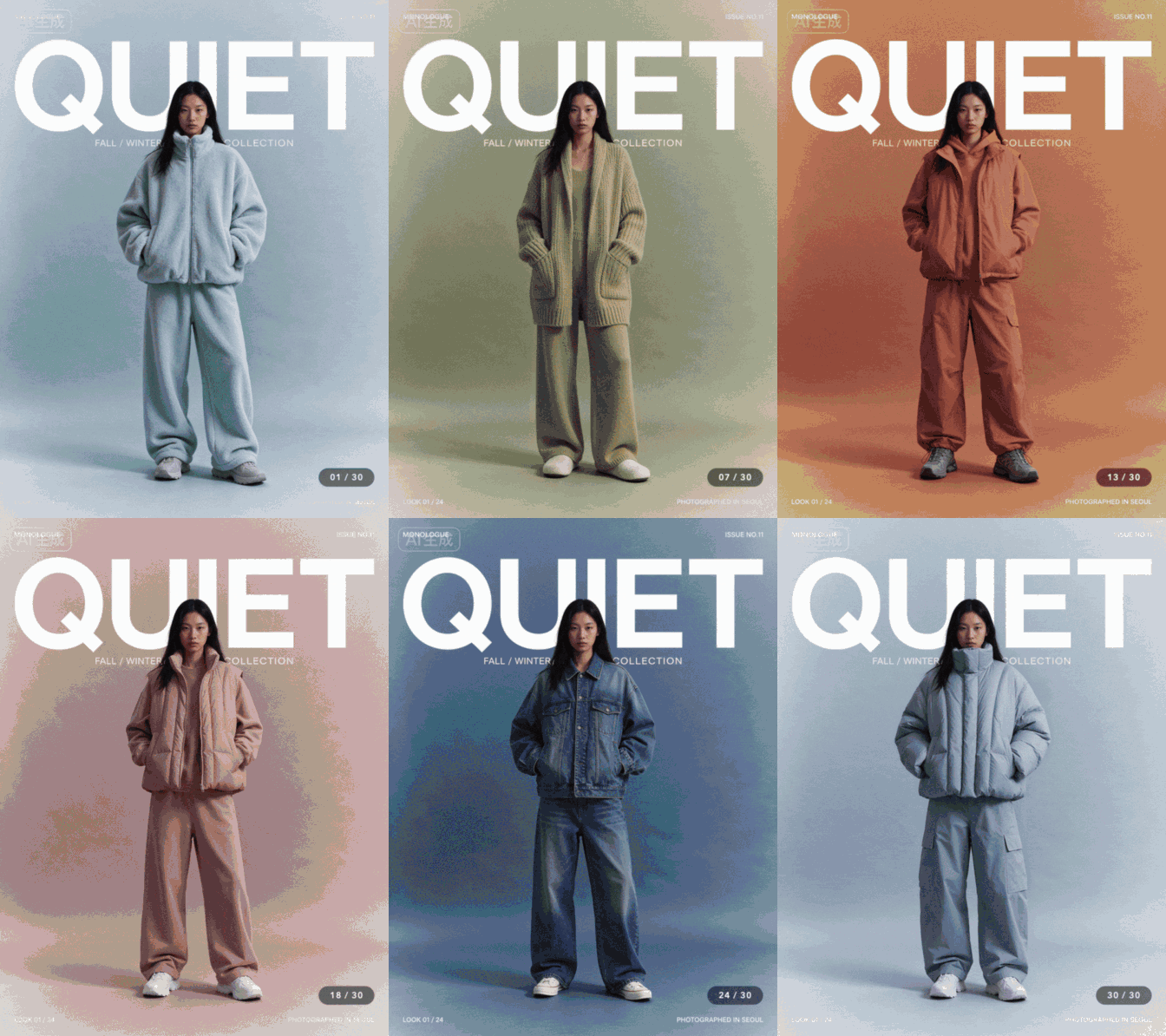
We tested Seedream 5.5 through a 30-round fashion-poster editing sequence, changing clothing and backgrounds while asking it to preserve the model’s face, pose, and poster typography. Each result became the input for the next round. We combined the results into a GIF to make the changes easier to compare.
What we found:
The model’s identity, centered pose, and text placement remained visually consistent as the styling changed.
The large “QUIET” headline stayed a stable part of the composition across the sequence.
Creative takeaway:
Our test illustrates how a single approved design can support a range of looks while retaining its visual identity.
It is one editing sequence, rather than a guarantee for every subject or revision.
Separate Refinement From Variant Creation
For your own project, choose the workflow that matches the goal:
Goal | Starting image |
|---|---|
Develop the latest design | Latest approved edit |
Explore independent alternatives | Same approved master |
Recover from unwanted changes | Earlier clean version |
Prompting tips:
Define the edit in three parts:
Target: identify the object or region to change.
Change: specify the new color, material, wording, or position.
Preserve: name the face, pose, framing, text, or surrounding details that should stay fixed.
For poster edits, distinguish the words themselves from their font, size, and placement.
For clothing changes, separate the garment’s appearance from the person’s identity and pose.
Before continuing, compare the face, headline edges, small labels, and image color with the approved version. If something unrelated changes, return to the clean version and narrow the request.
Workflow takeaway:
A long editing chain demonstrates endurance.
In daily production, keeping an approved master gives you a way to develop alternatives without carrying every previous change forward.
Make Local Changes Without Losing the Scene
Reference sequences extend the same idea to interface mockups, room layouts, and illustrated materials:
Interface updates: change a time, number, or chart while checking that the surrounding controls stay aligned.
Interior revisions: move an object and inspect its new shadow, occlusion, and the area it previously covered.
Material exploration: change one surface while preserving the object’s shape and neighboring elements.
In the watch example, the requested updates involve the time, activity figures, and a chart.
It gives you a useful way to evaluate local editing: compare both the changed content and the untouched bezel, layout, and neighboring labels.
These workflows can help develop campaign variants, presentation mockups, and visual concepts.
For an interface with exact production requirements, keep final typography and interactive behavior in your design or development tools.
How to Create More Realistic Images With Seedream 5.5
Make the lighting and materials tell the same story.
Describe Light Before Adding More Detail
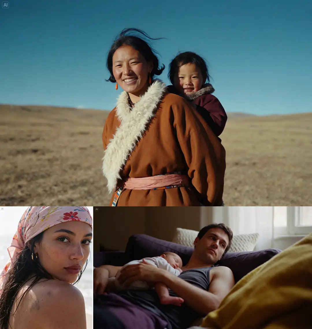
Photorealistic AI image prompts become more useful when they explain how the scene is lit. “Ultra-realistic” alone gives little direction.
The official portrait examples pair skin detail with directional light. A backlit portrait shows loose hair and a transition from highlight to shadow. A separate indoor image uses window light across a father holding a sleeping baby. These are useful references for judging how people and fabrics share the same environment.
For your own realistic portrait or lifestyle image, specify:
Light source: a window, overcast sky, or direct flash.
Direction: from the side, behind the subject, or above.
Material response: soft cotton, worn leather, brushed metal, or natural skin.
An everyday action: holding, reaching, repairing, or resting.
Prompting tips:
Connect the light, material, and action in the same description.
Explain how the light falls on skin and fabric, how the subject holds or touches an object, and which textures should remain visible.
Keep those physical details consistent with the framing.
Check the result:
Does the hand meet the object correctly?
Do highlights point to the same light source?
Does skin still have variation in shadow?
If the face looks polished or waxy, try replacing broad beauty language with a specific instruction such as “soft side light, restrained highlights, natural skin texture.” Treat that as a revision to evaluate, rather than a guaranteed fix.
Application ideas:
Use this approach for everyday portraits, lifestyle campaigns, and brand imagery.
Develop a coherent set by holding the lighting and color treatment steady while varying the subject’s activity or placement.
Give Creative Photography a Physical Basis
Realism does not require a neutral camera style. The reference examples include direct-flash photography and a tilted street composition. Their creative direction comes from recognizable photographic choices.
Choose one dominant camera idea, then support it:
Flash editorial: crisp nearby highlights, a darker background, restrained grain.
Candid street photography: off-center framing, believable wind, consistent perspective.
Product photography: a clear light direction and reflections suited to the material.
For an ecommerce campaign, decide whether you need an accurate product record or an atmospheric concept.
Keep a verified product photograph when exact construction, color, and labeling matter; use generated scenes to explore presentation.
How to Generate Transparent PNG Assets With Seedream 5.5
Create an element you can place into another design.
Understand Native RGBA Output
RGBA adds an alpha channel to red, green, and blue color information. Alpha describes opacity, including partially transparent areas.
That makes Seedream 5.5 transparent image generation relevant to stickers, cutout characters, decorative lettering, and compositing assets.
Fine edges and translucent materials deserve particular attention.
Prompting tips:
Describe the asset itself, then clarify how it should work outside the generated image.
Define the background: request transparency and avoid scene descriptions that introduce walls, floors, or scenery.
Keep the outline complete: specify full-object framing and enough space around fine details.
Separate material from background: explain which parts should be opaque or translucent. A transparent background does not mean the whole subject should become see-through.
Decide on shadows: indicate whether you need a clean cutout or a soft shadow, based on the layout where the asset will appear.
Create Material-Based Typography
The reference example renders “Seedream” as thick blue yarn lettering. Visible fibers, alternating tones, and rounded forms make the text work as a designed object.
To adapt this technique, upload a material reference and state which qualities to borrow. Supply the word separately so the model does not need to guess it.
Prompting tips:
Separate the exact wording, letter shape, and surface treatment.
Identify whether the reference supplies texture, color, or both, and clarify whether its lettering or layout should also influence the result.
Keep letter openings and spacing clear as you add material detail.
Make it useful:
Place the lettering on a plain layout first.
Check readability at thumbnail size before adding decoration.
Keep the material detail strongest around the contours and surfaces; excessive loose fibers across letter openings can make the word harder to read.
Application ideas:
Use tactile lettering as a reusable campaign headline, seasonal graphic, or social-cover element.
Explore different materials while keeping the wording and overall letter shapes consistent, then compare how each treatment fits the campaign.
Add supporting copy in your layout editor for precise spacing and easy updates.
Reuse Character Assets Across Layouts
The character showcase starts with a group of plush-style assets and reuses their designs in a new scene. This suggests a practical workflow for mascot campaigns and recurring social content.
For an identical character asset: composite the exported cutout into the new layout.
For a new pose or interaction: use the asset as a reference and inspect the regenerated details.
Prompting tips:
When generating a new pose, distinguish the requested change from the character details to preserve.
Name the defining silhouette, facial features, colors, and material rather than relying only on a general request for consistency.
Keep a small reference sheet showing those features. It gives you concrete details to compare when developing a series.
Application ideas:
Reuse one approved cutout across announcement cards, presentation slides, and community graphics.
When a scene needs a new gesture or interaction, create a reference-guided variation and compare it with the approved asset before adding it to the series.
How to Inspect the Transparent Result
1. Open it over both a light and a dark background.
2. Check that the background is genuinely transparent; a visible checkerboard can be baked into an opaque image.
3. Look for halos, clipped edges, and missing gaps.
4. Confirm that the export format preserves alpha. JPEG does not.
A PNG filename alone does not prove transparency. Also, native RGBA output does not automatically mean an editable PSD or a document containing separate layers.
Application ideas:
Build a small library of decorative elements for social posts, presentation slides, or campaign layouts.
Place each asset over the intended background before approving it, especially when translucent areas or soft shadows affect the result.
How to Create Clear Text and Multilingual Designs
Make the message easy to read before adding complexity.
Supply Exact Copy and a Clear Hierarchy
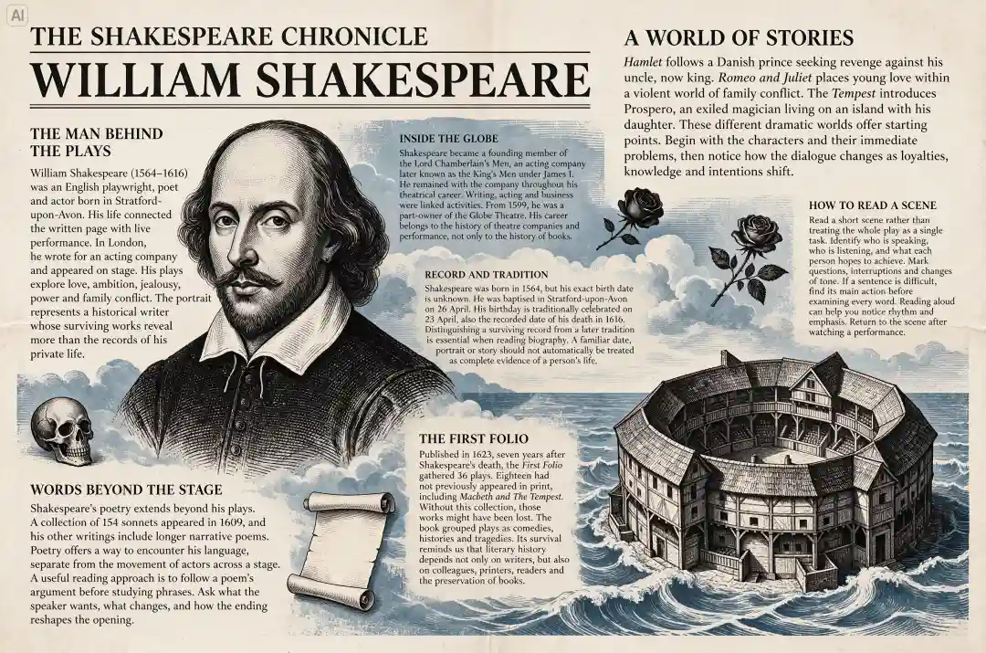
Seedream 5.5’s text-rendering showcase includes a newspaper-style English layout about Shakespeare. The page combines a portrait, illustrations, headings, and compact columns.
It provides a visual reference for combining text and imagery in editorial designs.
Prepare three things before generating:
1. Exact copy: write the words that must appear.
2. Hierarchy: identify the headline, supporting line, and small details.
3. Space: decide where the text belongs and what it must not cover.
Creative tips:
Separate the required wording from the visual direction.
Describe the headline’s size and placement, the supporting text’s role, and the space around each block.
If you use a reference, clarify whether it supplies the layout, typography style, or color palette.
Short copy is easier to check and revise. For dense information, organize the content into small blocks instead of asking the model to invent a page of text. Keep essential details away from busy imagery, and avoid squeezing long copy into decorative lettering.
Proofread at the intended display size. Check punctuation, dates, repeated letters, and small labels.
Attractive rendering does not establish that the information is factually correct. Add final copy in a layout editor when you need precise typesetting or frequent updates.
Application ideas:
Build an event poster around one clear headline, with dates and venue details in a quieter information block.
For an educational graphic, pair short explanations with relevant illustrations.
For a campaign series, keep the text hierarchy consistent while varying the imagery so each design remains recognizable.
Adapt a Layout for Another Language
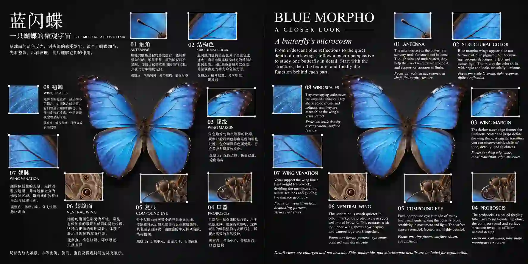
The multilingual reference examples pair Chinese designs with Japanese, Korean, English, and Russian versions. They illustrate a useful creative task: changing the language while retaining an overall visual identity.
For a multilingual AI poster, provide a reviewed translation rather than relying on the image model to write and validate it.
Creative tips:
Identify the text to replace and the visual elements to preserve, such as artwork, brand colors, and the relationship between headline and supporting copy.
Allow text blocks to resize or reflow when the translated wording needs more room.
Preserve the design’s hierarchy rather than identical line breaks. Different word lengths may require a wider text box or a different line count.
Check that the typeface supports the target language and that accents, punctuation, and characters remain readable.
Application ideas:
Create localized event graphics around shared artwork, giving each language enough space for practical details.
For bilingual educational posters, place related text blocks beside the same illustration so readers can connect them easily.
For regional campaign drafts, retain the core visual identity while adapting the message and information order for each audience.
Have a fluent reader check the language before publication, including names, dates, and location details. Review each version in its final format; a balanced source layout may need adjustment after translation.
Creative Ways to Use Seedream 5.5
Build a campaign, refresh a portrait, or create assets you can reuse.
Product Photography and Seasonal Ad Creatives
Use realistic lighting and reference-guided editing to explore new settings around a product photo.
Studio shots: highlight shape, texture, and reflections.
Lifestyle images: place the product in an everyday setting.
Seasonal ads: vary props and backgrounds for holiday campaigns.
Adapt the chosen look into banners, social ads, and email headers.
Check labels, colors, and proportions against the original product.
YouTube Thumbnails and Social Campaign Covers

Combine subject references, expressive lighting, and targeted edits to create a clear visual hook.
Build reaction thumbnails around a readable expression.
Give product reveals one strong focal point.
Keep framing and colors consistent across episode covers.
Review at mobile size. Add final headlines in your editor for precise typography.
Fashion Editorials and Personal Portrait Concepts
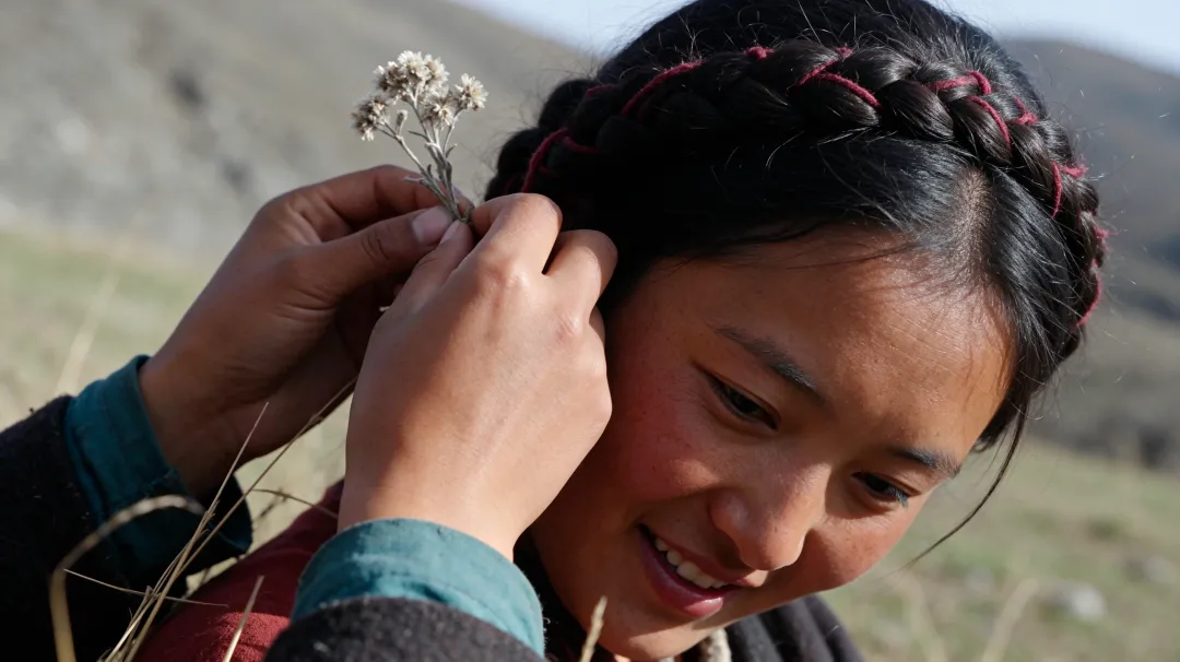
Explore skin detail, fabric texture, and lighting variations around a portrait reference.
Direction | Creative use |
|---|---|
Soft natural light | Profile images and personal introductions |
Direct flash | Fashion editorials and social covers |
Cinematic lighting | Website heroes and editorial concepts |
Develop a coordinated portrait set. Check facial features after edits; treat outfit changes as styling concepts.
Transparent Stickers and Tactile Brand Kits

Use native RGBA and material-based lettering to create a reusable asset library.
Mascot cutouts: welcome cards and announcements.
Reaction stickers: replies and milestone celebrations.
Textured lettering: campaign headlines and presentation slides.
Keep one palette and material style across the kit. Composite approved cutouts for identical reuse, and check transparency on the final background.
Multilingual Launch Campaigns and Event Graphics
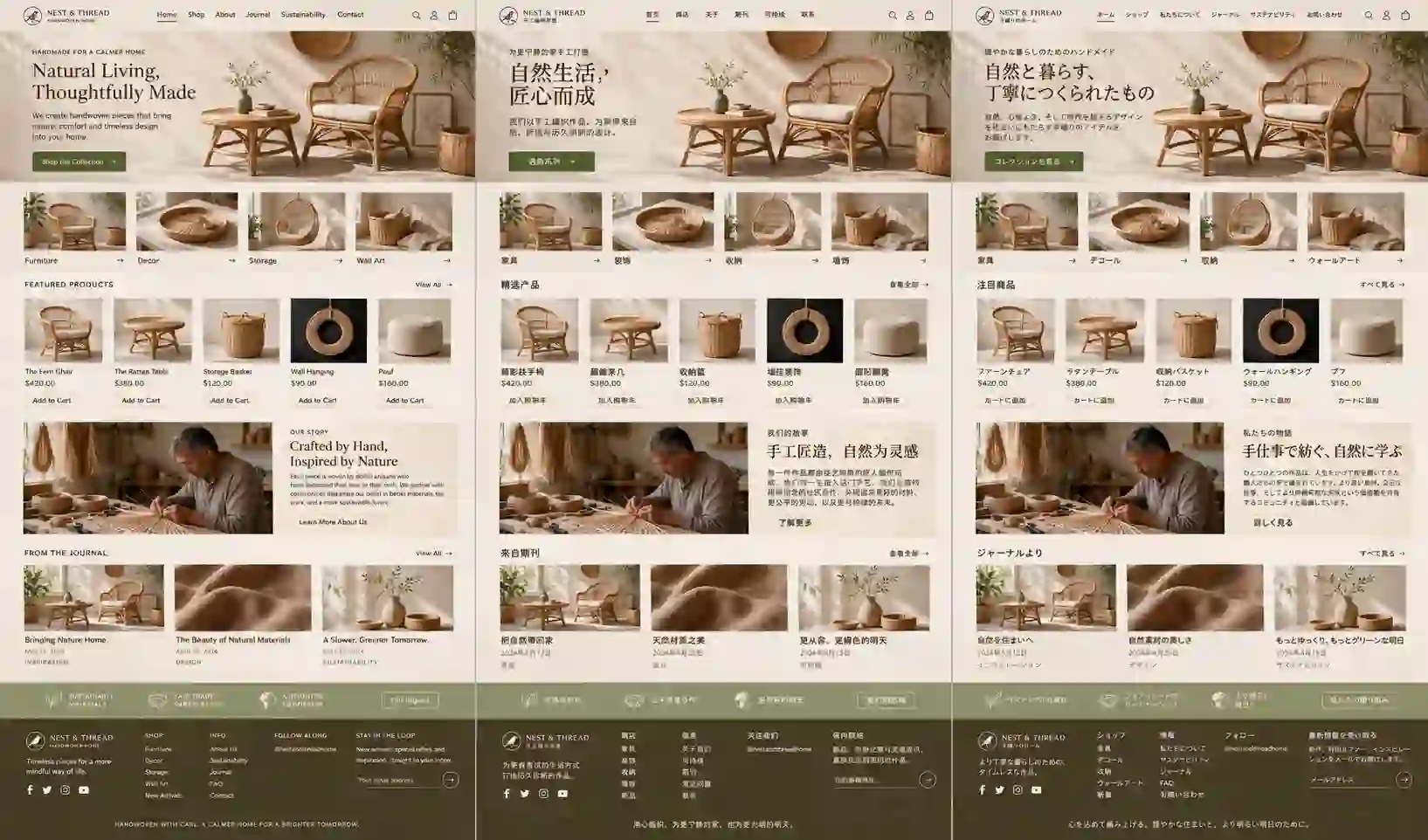
Combine text rendering and multilingual layouts to adapt one campaign for different audiences.
Create a main poster, social announcement, and information card.
Retain shared artwork and brand colors across languages.
Let translated headlines reflow to fit their wording.
Apply this to product launches, bilingual events, or educational graphics. Have a fluent reader review each language version.
Interior Makeovers and Design Presentations

Use reference-guided composition and local edits to compare ideas from the same room image.
Home offices: explore desk placement, storage, and wall colors.
Retail displays: try seasonal props and surface finishes.
Client boards: compare furniture and material directions.
Keep the viewpoint consistent. Check shadows and reflections, then confirm real dimensions before purchasing.
Explore AI Image Creation Guide
Seedream 5.5 FAQs
Can Seedream 5.5 Generate GIFs or Videos?
Seedream 5.5 is an image model. Its showcase includes running-pose sequences, but a sprite sheet needs frame extraction and assembly to become an animated GIF. For generated motion, use a video model such as Seedance, then convert the result if needed.
Does Seedream 5.5 Support 4K Output?
The official model and launch pages reviewed here do not establish a universal 4K output setting. Check the resolution offered by the specific deployment and inspect the downloaded dimensions. Upscaling and native generation are different operations.
Can I Use It to Edit an Existing Product Photo?
Reference-guided editing can help explore backgrounds, styling, and presentation. Compare the result with the original product: labels, proportions, colors, and small construction details can matter. Keep the verified product asset when those details must remain exact.
Is Seedream 5.5 Pro Available?
The November 9 announcement describes a Pro version as a future release. It does not establish current Pro access, specifications, or pricing.
Is Seedream 5.5 Better Than GPT Image 2.6 or Nano Banana 2.1?
There is no single answer for every project. The official comparison uses GPT Image 2.5 Sunburst and shows mixed results against Nano Banana 2.1 across tasks. For your own decision, compare the deliverables you need: realistic rendering, text accuracy, targeted edits, and reusable transparent assets.